
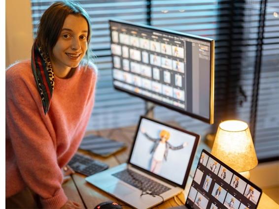
Many designers avoid cookie-cutter web templates. Similarly, experienced website designers tend to avoid websites generated by AI. Therefore, designers who craft custom websites use Photoshop. More importantly, designers can use Photoshop to enhance the look of original photos, thereby contributing a websites’ authenticity.
Be aware that the amount of space on the sides of most modern websites can vary. Occasionally, a background might be occupied by a texture, image, or design element. When the browser screen’s background is filled, it gives the illusion that the website covers the entire screen. Alternatively, you may choose to keep your main content area at a fixed width. See Web Images Specifications Cheat Sheet
In many directory-style websites, you’ll find no background images; instead, you’ll see white or other solid colors. Thus, it’s advisable to decide on a ‘fixed-width viewing area’ before creating a new website or revamping an existing one. For example, see the video below.
Android and Apple Devices
In most Android and iOS systems, touch screens like those on the Galaxy or iPad automatically respond to fit the screen, unless a CSS style, image, table, or div tag exceeds a width of 1960 pixels.
Website Pixel Width for a Safe Image Area
|
Device screen width
|
width x height |
| iPhone portrait (320 px) | PSD img. size best viewing = 320 px |
| iPhone landscape (480 px) | PSD img. size best viewing = 480 px |
| iPad portrait (768 px) | PSD img. size best viewing = 768 px |
| iPad landscape (1024 px) | PSD img. size best viewing = 1024 px by 860 |
| Browser screen: 800 px | PSD img. size best viewing = 760 px by 480 px |
| Browser screen: 1024 px | PSD img. size best viewing = 989 px by 548 px |
| Browser screen: 1152 px | PSD img. size best viewing = 1117 px by 644 px |
| Browser screen: 1280 px | PSD img. size best viewing = 1245 px by 580 px |
| Browser screen: 1360 px | PSD img. size best viewing = 1325 px by 548 px |
| Browser screen: 1366 px | PSD img. size best viewing = 1331 px by 548 px |
| Browser screen: 1440 px | PSD img. size best viewing = 1405 px by 680 px |
| Browser screen: 1600 px | PSD img. size best viewing = 1565 px by 680 px |
| Browser screen: 1680 px | PSD img. size best viewing = 1645 px by 825 px |
| Browser screen: 1920 px | PSD img. size best viewing = 1885 px by 855 px |
| Browser screen: 2048 px | PSD img. size best viewing = 1925 px by 1014 px |
| Browser screen: 2560 px | PSD img. size best viewing = 2018 px by 1014 px |
Above all, do not forget to Optimize Your Images for the Web.
Also, see:
How Do I Start A Website
Use Your Digital Assets to Increase SEO
Browser and Computer Screens
About VISIONEFX
At VISIONEFX, we recognize that exceptional design enhances websites and delivers top-notch web design. Our offerings include tailored web design, web development, e-commerce solutions, and platform development for popular content management systems such as WordPress, Drupal, and Joomla. Additionally, we provide SEO and website maintenance services.
Please take a moment to read what our customers have to say about us on Google Reviews!
For more information about Web Design Services, contact us at (757) 619-6456.
You may also reach us by email at info@visionefx.net.

