
Full Screen versus Fixed-Width Website Layouts
Web design has evolved dramatically over the past two decades as screens, devices, and user preferences have changed. Gone are the days when most internet users accessed the web through a 1024×768 desktop monitor.
Today, designers must account for an overwhelming variety of screen sizes: massive 5K monitors, mid-sized laptops, tablets, and smartphones with pixel densities higher than many televisions.
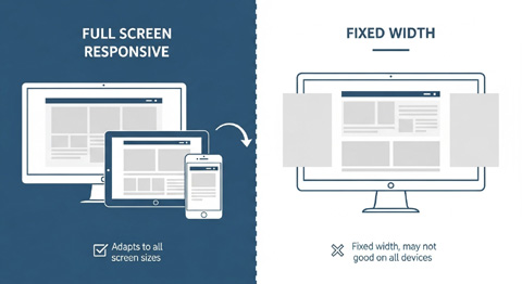
One of the most significant design considerations in this landscape is whether to use a full-screen responsive layout—which adapts to fill the user’s viewport—or a fixed-width layout—which maintains a consistent content width regardless of the device screen size.
This article explores the nuances of both approaches, weighing their pros and cons, discussing real-world scenarios in which one option may be more advantageous than the other, and examining the challenges posed by browser behavior, zoom settings, screen resolutions, and user preferences.
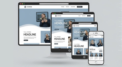
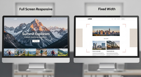
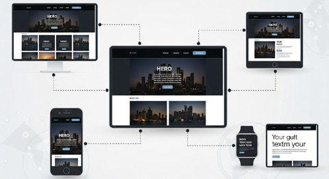
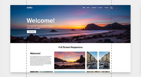
Full Screen Responsive Layouts
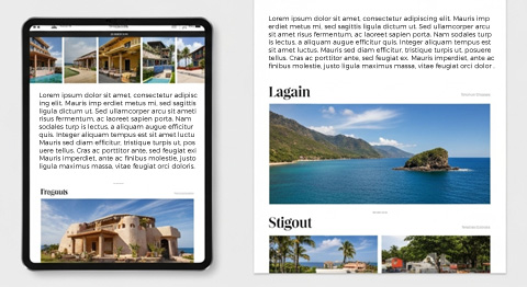
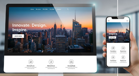
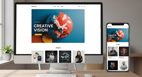
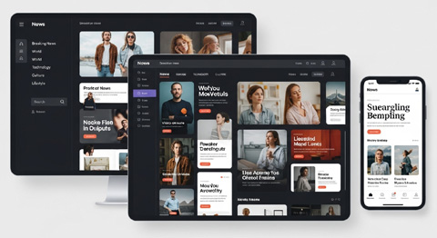
A custom full-screen responsive web design layout stretches or contracts to fill the user’s viewport, whether it’s a giant desktop monitor, an average-sized laptop, or a phone held in portrait mode.
The content dynamically adjusts based on the available screen real estate, often using flexible grids, fluid images, and CSS media queries.
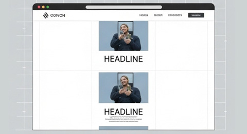
Fixed-Width Layouts
Fixed-width layouts restrict the width of content to a predefined number of pixels, regardless of the device or viewport size.
While they can be centered or aligned, they don’t expand beyond their set boundaries, which ensures a consistent look and reading experience.
However, this may result in wasted space on large screens or horizontal scrolling on smaller ones if not appropriately accommodated.
Pros and Cons: Full-Screen Responsive Layouts vs. Fixed-Width Layouts
Pros of Full-Screen Responsive Layouts
- Device Adaptability: Works seamlessly on a variety of screen sizes from smartphones to ultra-wide monitors.
- Modern Aesthetic: Provides a contemporary, immersive web experience that feels fluid and engaging.
- Efficient Use of Space: No large blank margins on wide screens; content adjusts to fit.
- User-Centered: Meets expectations of mobile-first users who demand responsive design.
- SEO Benefits: Mobile responsiveness is a ranking factor for search engines like Google.
- Scalability: Future-proof against evolving screen technologies, from foldable phones to large curved displays.
The table below provides a quick visual summary of the strengths and trade-offs for each layout method, supporting the analysis in the article above.
| Aspect | Full Screen Responsive | Fixed Width |
| Device Adaptability | (+) | (−) |
| Design Consistency | (−) | (+) |
| Readability on Large Screens | (−) | (+) |
| Modern Aesthetic | (+) | (−) |
| Performance | (−) | (+) |
| SEO/Mobile Friendliness | (+) | (−) |
| Browser Zoom Handling | (−) | (−) |
| Branding Control | (−) | (+) |
| Content Space Utilization | (+) | (−) |
Cons of Full-Screen Responsive Layouts
- Readability Issues on Wide Screens: Text lines can stretch too far across the screen, reducing readability without careful design constraints. Also, see The Art of Website Redesign.
- Design Complexity: Requires more work from designers and developers to ensure breakpoints and layouts render cleanly.
- Performance Considerations: More resources and testing are needed to support a wide variety of devices and resolutions.
- Content Bloat Risk: Attempting to accommodate every screen size can result in clutter or unnecessary complexity.
- Inconsistent User Experience: Depending on the zoom or resolution settings, content might feel cramped or overly stretched.
Pros of Fixed-Width Layouts
- Design Consistency: Offers a predictable, uniform look across all screens. Also see Website Redesign Before & After.
- Simpler Development: Easier to design, test, and maintain since dimensions are static.
- Readability: Keeps graphics and icons from spanning the page and prevents super-wide, hard-to-read paragraphs.
- Brand Control: Ensures layouts display exactly as intended without unexpected rearranging.
- Stable Advertising Placement: Ad slots and embedded elements remain in the same position regardless of varying window sizes.
Cons of Fixed-Width Layouts
- Wasted Space on Large Screens: Users with big monitors may see large margins on the sides.
- Poor Adaptability on Mobile: Without additional effort, small screens can force horizontal scrolling.
- Outdated Feel: Fixed layouts can look old-fashioned compared to the flexibility of modern responsive design.
- Accessibility Concerns: Users with zoom preferences may experience broken or complex layouts.
- Requires Media Queries Anyway: To accommodate mobile devices, many “fixed” layouts end up partially responsive, negating the simplicity.
When to Use Full-Screen Responsive Layouts
- News and Content Platforms: Blogs, newspapers, or resource-heavy sites benefit since responsive designs can restructure content across devices.
- E-commerce Stores: Shopping experiences improve when layouts adapt gracefully to both desktop “window shoppers” and mobile buyers.
- Creative Portfolios: Full-width visuals, photography, or design portfolios shine in responsive frameworks.
- Web Applications: Dashboards and SaaS platforms often need adaptive layouts to serve desktops and tablets equally.
When to Use Fixed-Width Layouts
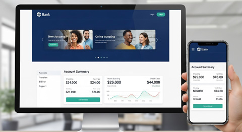
- Corporate or Professional Sites: In industries where consistency and predictability are vital, such as law firms or banks.
- Content with Fixed Dimensions: Sites featuring fixed-size advertisements, infographics, or specific scientific visuals.
- Specialized Intranets: Internal tools that may not require adaptation beyond a controlled device ecosystem.
- Minimalist Branding Pages: Some luxury or prestige brands prefer fixed, precise layouts to maintain strict visual integrity.
Browser Behavior and User Preferences
Zoom Settings
Different browsers handle zoom differently:
- Chrome and Edge: Scale the entire page, adjusting elements fluidly.
- Firefox: Offers both full-page zoom and text-only zoom, which can impact readability in full-screen responsive designs.
- Safari: Sometimes interprets zoom scaling differently, particularly on iOS devices.
Fixed-width layouts may break disproportionately under zoom adjustments if not thoughtfully designed. For example, a 1200px fixed-width site may force horizontal scrolling when viewed on a small laptop at a high zoom level.

Screen Resolutions
- Desktop Monitors: High-resolution monitors (e.g., 4K or 5K) can make full-screen, responsive layouts feel immersive, while fixed widths leave vast amounts of space.
- Laptops: Typically, a hybrid approach works best, since laptop users need readability without overwhelming margins.
- Mobile Devices: Full-screen responsiveness is essential, as fixed widths often compromise usability on phones.

Personal Preferences
Many users will use different browsers simultaneously. On the other hand, some users manually adjust their browser width for multitasking, such as keeping two windows side by side.
Fixed-width layouts appear more predictable in these cases, while full responsive designs try to fill reduced window space dynamically—sometimes with cluttered results.
Designers must strike a balance between flexibility and readability. Also, see Redesign Your WordPress Business Website in 2025.
FAQ: Full Screen Responsive vs. Fixed Width
Q: Which type of layout is better for SEO?
A: Full-screen responsive layouts are generally better for SEO since Google prioritizes mobile-friendly, adaptable sites.
Q: Do fixed-width layouts still have a place in modern web design?
A: Yes. They are helpful in specific contexts where content strictly adheres to brand or format requirements, such as legal disclaimers, PDFs, or internal enterprise platforms.
Q: What about hybrid layouts?
A: Many modern designs use a hybrid approach—fixed max-width containers within an overall responsive framework. This prevents overly long text lines while still scaling images and background sections fluidly.
Q: How do screen resolutions affect full-screen responsive design?
A: On giant monitors, fully responsive layouts risk stretched designs unless constrained by max-width properties. Designers often use column systems and central bounding to keep layouts readable.
Q: Does user zoom render responsive design useless?
A: Not at all, but it can pose challenges. Designers should test across zoom levels to ensure readability and flexibility hold up across browsers.
Q: Should all websites abandon fixed widths?
A: Not necessarily. While responsive design dominates, fixed widths offer precision and control that some industries require.
Practical Examples
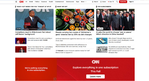
- Media Outlets (CNN, BBC, The New York Times): Rely on full-screen responsive layouts to handle a vast readership on desktops, tablets, and smartphones.
- Luxury Product Sites (Rolex, Louis Vuitton): Sometimes prefer fixed-width or bounded designs to maintain precise brand imagery and prevent distortion.
- SaaS Applications (Asana, Slack, Trello): Use responsive layouts with fixed-width central containers, combining both approaches to ensure readability and flexibility.
- Government Portals: May adopt stricter fixed layouts for consistency across devices where accessibility is critical.
Balancing Full Screen and Fixed Width
In practice, many of the best designs blend the advantages of both approaches. Responsive frameworks like Bootstrap or Tailwind CSS allow developers to define breakpoints, but also constrain readability with max-width columns. This way:
- Text areas remain readable (like fixed width).
- Backgrounds, banners, and media expand fluidly (like full screen).
A central content column bounded at 1200–1400px ensures readability, while the general layout remains adaptable beyond those limits.
Final Thoughts
Choosing between a full-screen responsive layout and a fixed-width layout is not about which is “better” universally—it’s about selecting the approach that best matches the site’s content, audience, and long-term goals.
Full-screen responsiveness aligns with today’s mobile-first, multi-screen digital environment, while fixed-width designs still hold strategic value where control, consistency, or brand-image precision is required.
In most cases, employing a hybrid strategy—responsive overall with bounded central content—is the best way to satisfy the broad spectrum of devices and user preferences in 2025 and beyond.
About VISIONEFX
We design professional websites for small business owners throughout the United States.
Please read what our customers have to say about VISIONEFX on Google Reviews.
For more information, call (757) 619-6456 or use our contact form.

