A successful website does more than present information — it guides visitors, captures their attention, and encourages them to take action.
Moreover, well-designed graphics, icons, and calls to action (CTAs) provide subtle but powerful cues that enhance usability, branding, and conversions.
When used strategically, these visual and interactive elements transform passive browsers into engaged customers.
This article explores the role of graphics, icons, and CTAs in modern website design. Furthermore, we will examine why they matter, how to utilize them effectively, and common mistakes to avoid. Above all, you will also find a practical listicle of best practices and a set of FAQs to wrap everything up.
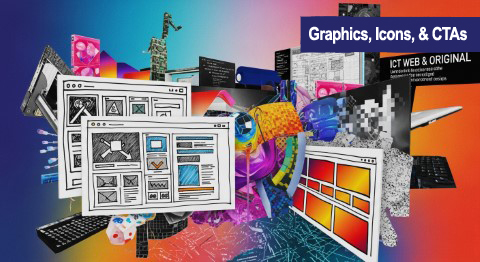
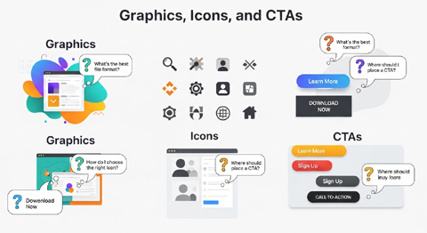
Why Graphics and Icons Matter in Website Design
Humans are visual learners. Studies show that people process visuals 60,000 times faster than text. This is why icons and graphics function not only as decoration but as essential usability tools.
- Guidance: Icons act as road signs for your site, making navigation intuitive without overloading visitors with text.
- Branding: Custom graphics reflect your company’s personality, product focus, and professionalism.
- Memorability: Specialized icons or stylistic imagery help users remember your brand and return to your site.
- Trust: Clean, recognizable visuals make a business look credible and reliable.
In short, graphics and icons are far more than aesthetics — they’re communication tools.

The Role of Call To Actions (CTAs)
While icons catch the eye, CTAs inform the visitor of the next step. A CTA might be a button, a highlighted link, or even a graphic with linked text. Moreover, it bridges the gap between engagement and conversion.
Examples of CTAs include:
- “Sign Up for Free” buttons
- “Buy Now” purchase prompts
- “Learn More” links in service overviews
- “Download Guide” offers gated content
Most importantly, the strength of your CTAs can significantly influence your conversion rate. A confusing or uninspired CTA often means a missed opportunity.
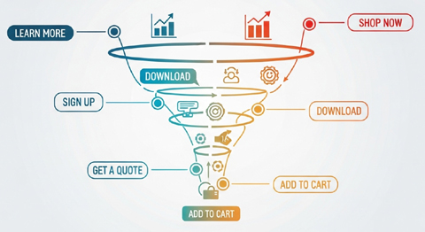
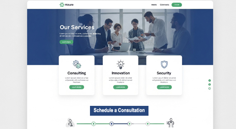
How Graphics and CTAs Work Together
When combined, graphics and CTAs form a visual funnel. Icons make content scannable, illustrations create mood or interest, and a well-designed CTA provides the action step.
For example:
- An ecommerce product page may use icons to display product benefits (free shipping, secure checkout, eco-friendly), followed by a prominent “Add to Cart” button.
- A service page might use custom graphics to highlight expertise, ending with a bold “Schedule a Consultation” CTA.
The workflow is consistent: attract attention → confirm value visually → point to the action step.
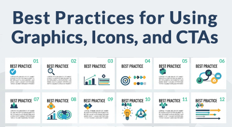
12 Best Practices for Using Graphics, Icons, and CTAs
1. Keep Icons Simple and Recognizable
Use icons that instantly communicate meaning. Overly complex or abstract designs confuse visitors instead of helping them.
2. Maintain Consistent Style
Choose a design family for your icons (flat, outline, filled, or 3D). Consistency strengthens your branding and provides a polished look.
3. Optimize for Mobile Devices
Ensure graphics and CTAs scale appropriately on different screen sizes. A button that’s easy to click on a desktop may be too small on a mobile device.
4. Use Color Wisely
Colors can guide behavior. For instance, green often signals “go” while red creates urgency. However, align with your brand palette for consistency.
5. Add Contrast for CTAs
Buttons and links should stand out from surrounding content. High-contrast colors and whitespace around CTAs increase visibility.
6. Make Icons Functional, Not Just Decorative
An icon should clarify — not clutter. Use them for menus, services, bullet points, and instructions where they enhance understanding.
7. Use CTAs that Create Urgency
Wording like “Register Today” or “Claim Offer Now” encourages faster decisions compared to generic “Submit” buttons.
8. Avoid Too Many CTAs on a Single Page
If every section is vying for attention, visitors may get confused or overwhelmed. Instead, offer one primary CTA and a few secondary options.
9. Test Different CTA Placements
Experiment with placing CTAs at the top, middle, and bottom of your pages to see which placement works best. Analytics will tell you where your audience responds best.
10. Pair Icons with Short Text Labels
Icons alone may not always be understood. Adding a quick label like “Email Us” under an envelope icon reduces ambiguity.
11. Ensure Accessibility
Icons and CTAs must meet ADA and WCAG accessibility standards. Use alt text, proper color contrast, and labels for screen readers.
12. Use Motion Sparingly
Animated graphics or buttons can help draw attention, but too much motion distracts. Keep effects subtle (e.g., a hover color change).

Common Mistakes to Avoid
- Overloading pages with too many icons: This creates clutter rather than clarity.
- Stock-style overuse: Generic graphics can dilute brand identity. Custom or semi-custom icons often work better.
- Weak CTA text: Phrases like “Click Here” lack direction and persuasion.
- No clear hierarchy: If CTAs and images compete for attention, visitors don’t know where to focus.

Examples of Graphic and CTA Placement
1. Homepage Hero Section
- Extensive background graphic or illustration
- Headline with short supporting text
- Primary CTA button (“Start Free Trial”)
2. Service Page
- Service icons to break up text
- Small CTAs under each section (“Get a Quote”)
- Primary CTA at the end of the page for conversion
3. Product Landing Page
- Product images with benefit icons (guarantee, warranty, free returns)
- CTA under each product sample (“Add to Cart”)
- Sticky CTA that stays visible as users scroll

The Psychology Behind CTAs
Designing a compelling CTA is not just about color and size — it’s about psychological triggers:
- Clarity: People act when they know exactly what will happen next. (“Download the PDF Guide”)
- Scarcity: Limited-time offers push decision-making. (“Only 2 Hours Left!”)
- Value-driven: The user must perceive immediate benefit. (“Get My Bonus Now”)
- Personalization: CTAs written in first-person yield higher engagement. (“Send Me My Free Report”)
These triggers, paired with consistent visual design, significantly improve user response.
Aligning Graphics and CTAs With Your Brand
Your design choices must fit with your overall brand personality:
- A luxury brand may prefer minimalist icons with high contrast and elegant CTAs.
- A tech startup might use futuristic or playful graphics with bold, innovative CTAs.
- A local service provider could feature approachable, helpful icons paired with clear action steps like “Call Us Today.”
Consistency ensures your site feels authentic and trustworthy.
FAQs About Graphics, Icons, and CTAs
Q1: Should I use custom icons or free icon libraries?
Custom icons offer more substantial brand alignment, but free libraries (like Font Awesome) are excellent for everyday functions. Instead, consider using custom icons for brand-unique elements and standard sets for universal elements, such as “phone” or “cart.”
Q2: How many CTAs should a page have?
A landing page should have one clear primary CTA and, optionally, one or two secondary CTAs. Too many creates decision paralysis.
Q3: Where should I place my CTA on a webpage?
Above the fold (top section) is essential, but users also expect CTAs at the end of the content. Secondary CTAs can be spread naturally throughout the page.
Q4: Do graphics slow my website down?
Unoptimized images can slow load times. Therefore, always compress graphics, use modern formats like WebP, and leverage lazy loading for faster performance.
Q5: Should every icon be clickable?
Not necessarily. Icons can be purely informational, such as illustrating the benefits of a service. However, navigational or action-based icons (like social media or email) should be interactive.
Q6: How do I know if my CTA is working?
Track conversions in analytics or run A/B testing—test variations in wording, placement, and color. Minor adjustments can produce significant results.
Q7: Are animated CTAs more effective?
Subtle movement (hover effects, bouncing arrows) can increase attention, but excessive animation can hurt usability and appear unprofessional.
Q8: Do CTAs differ for mobile users?
Yes, buttons must be large enough for touchscreen use and placed where thumbs naturally tap (typically the center or lower part of the screen).
Q9: What’s the role of CTAs in SEO?
CTAs don’t directly affect search rankings, but they reduce bounce rates and increase engagement signals — both of which indirectly support SEO.
Q10: How do I design CTAs for different customer journeys?
Tailor CTAs to match readiness levels:
- Awareness stage → “Learn More”
- Consideration stage → “Compare Plans”
- Decision stage → “Buy Now”

Homepage Layout Example
Hero Section (Top of Page):
- Large banner graphic (illustration or photography that represents the brand).
- Headline + supporting tagline.
- Primary CTA button centered: “Get Started Today”.
Mid-Page Services Section:
- 3-4 columns with service icons (e.g., wrench, chat bubble, shield).
- Each icon is paired with a short headline + one-line description.
- Small CTA links under each service: “Learn More”.
Conversion Area:
- Bold full-width graphic showing people using the product/service.
- Prominent CTA in contrasting color: “Claim Your Free Demo”.
Footer:
- Social icons for navigation (Facebook, LinkedIn, Instagram).
- Final mini CTA: “Subscribe to Our Newsletter”.
Service Page Layout Example
Header Area:
- Clean custom banner graphic (industry-specific).
- Main title with a supporting CTA in top section: “Schedule a Consultation”.
Body Content:
- Break down services into sections with custom line-art icons (e.g., a clock for “timely service,” a shield for “trusted experts”).
- Each service block ends with a CTA button: “Request a Quote”.
Trust Section:
- Row of credibility icons (certifications, awards, guarantees).
- Reviews/testimonials with star icons.
Final Section:
- Minimalist graphic or background photo.
- Strong CTA in a bold button: “Let’s Get Started”.
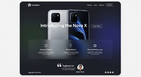
Product Landing Page Layout Example
Above the Fold:
- Large high-quality product image with background graphic styling.
- Headline highlighting value proposition.
- Main CTA button (bright color): “Add to Cart”.
Product Benefits Section:
- Grid of benefit icons (free shipping, eco-friendly, secure checkout).
- Short text labels under each icon.
Demo or Explanation Video (Optional):
- Video thumbnail with play icon graphic.
- Secondary CTA: “Watch How It Works”.
Urgency/Offer Section:
- Graphic badge (limited-time/discount symbol).
- CTA: “Buy Before Midnight and Save 15%”.
Sticky CTA:
- The floating “Add to Cart” button is visible while scrolling on both desktop and mobile devices.
Each of these layouts helps guide the visitor’s eye through visuals (graphics/icons) and then funnels them into a clear action step (CTA buttons/links).
The balance of icons and CTAs ensures that the design is functional, not decorative.
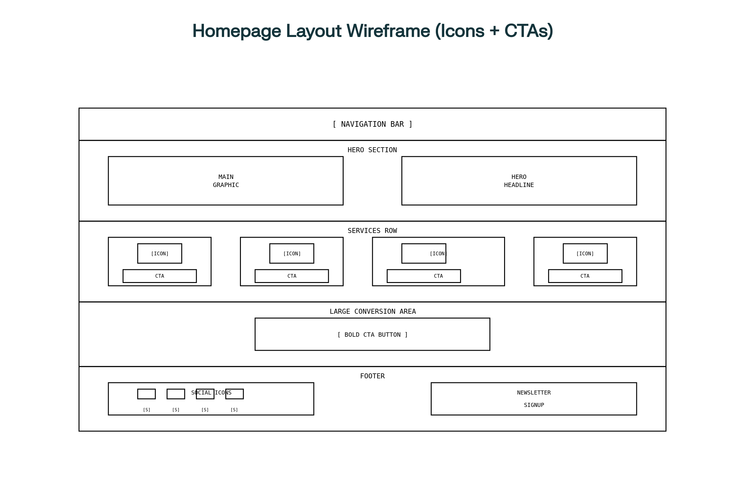
Homepage Layout Wireframe (Icons + CTAs)
- The hero section features a main graphic, headline, and the primary CTA.
- The services row presents 3–4 icons, each paired with a CTA underneath.
- A significant conversion area draws attention to a key action.
- The footer includes social icons and a newsletter signup CTA.
Conclusion
The clever use of graphics, icons, and CTAs makes a modern website functional, appealing, and conversion-oriented. Specifcally, graphics and icons shape first impressions while guiding navigation. Finally, CTAs seal the deal by converting attention into action.
When paired thoughtfully, they can dramatically increase engagement, sales, and leads. Therefore, focus on simplicity, usability, and brand alignment. Moreover, test your design choices and monitor performance in analytics.
Over time, you will discover which combinations of visuals and CTAs resonate most strongly with your audience — and that’s where meaningful growth happens.
About VISIONEFX
We design professional websites for small business owners throughout the United States.
Please read what our customers have to say about VISIONEFX on Google Reviews.
For more information, call (757) 619-6456 or use our contact form.

