
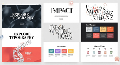
Typography is one of the most crucial elements in website design, shaping not only how content looks but also how it is understood, navigated, and remembered.
When used appropriately, typography creates a visual hierarchy, establishes mood, guides user attention, and enhances readability.
When used poorly, it can lead to confusion, frustration, and a negative perception of the entire website.
From the early days of web development to today’s highly stylized and responsive digital spaces, typography has evolved dramatically.
Understanding its history, application, and best practices provides website designers with the tools to make impactful choices that balance beauty with usability.
This article explores the history of typography in communication and digital design, examines its role in creating effective websites, discusses font styles in practice, presents the pros and cons of typography in website design, and highlights examples of when different font choices are more desirable.
A Brief History of Typography in Communication and Design
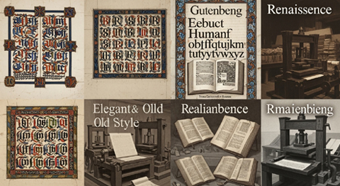
Typography begins with the invention of movable type in the 15th century by Johannes Gutenberg.
The Gutenberg Bible revolutionized written communication by making books more accessible and setting the foundation for mass communication.
Typeface choices were initially limited to blackletter scripts, which were ornate and resembled manuscripts.
Over time, more readable serif typefaces like Garamond and Caslon were developed and widely used in print.

Typography in Print and Advertising
As printing expanded, typography became an art form.
Designers used type not only to convey meaning but also to express emotion and tone.
By the 19th and early 20th centuries, typography was integral in advertising and poster design, with bold sans-serif fonts developing alongside decorative display styles to attract attention.
Typography in Early Digital Media
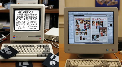
With the advent of personal computers in the 1980s and 1990s, digital typography was born.
Early systems like Macintosh introduced scalable fonts and allowed designers to experiment with different typefaces on screens.
But when the internet emerged in the 1990s, fonts were limited to web-safe colors and “web-safe” options such as Arial, Times New Roman, Verdana, Georgia, and Courier. These were chosen for their universal compatibility and legibility on pixel-limited monitors.
The Rise of Web Typography
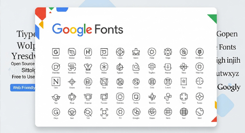
By the late 2000s, with technologies like CSS (Cascading Style Sheets) and the rise of services like Google Fonts and Adobe Fonts, web designers gained far greater control over typography.
This allowed them to implement custom fonts without worrying about user compatibility.
Advances in screen resolution have also made more complex and elegant fonts readable online.
Today, typography is central in user experience (UX) design, search engine optimization (SEO), and brand identity on the web.
The Importance of Typography in Website Design
Typography on a website is more than aesthetics; it directly impacts usability, accessibility, and brand perception.
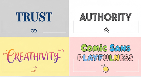
Visitors to a site often form an opinion in seconds, and the fonts used can subconsciously communicate trust, authority, creativity, or playfulness. The same applies to the use of graphics and icons on your website.
- Readability and Legibility: Fonts determine whether visitors can easily read content without straining their eyes. Good typography accounts for size, spacing, and contrast.
- Hierarchy and Navigation: Using distinct font sizes and weights helps create a visual hierarchy, allowing users to scan content. Headlines, subheadings, and body text should be differentiated to guide attention.
- Brand Voice and Tone: Fonts are tied closely to identity. A financial institution may use conservative serifs for seriousness and professionalism, while a creative agency may use bold sans-serif fonts for modernity and innovation.
- User Engagement and Retention: Poor font choices can cause readers to abandon a site. Well-structured typography encourages exploration and longer on-page time.
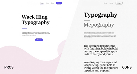
Pros and Cons of Typography in Website Design
Typography offers both advantages and challenges.
When choosing between different styles and font families, designers must weigh aesthetics, functionality, and accessibility.
Typography plays a dual role as both a practical tool and an expressive medium, and that balance creates unique advantages and challenges for designers.
Choosing type is never a purely aesthetic decision; it directly affects how people absorb, comprehend, and respond to written content.
Pros
- Enhances readability: Properly chosen fonts make long-form content more readable.
- Strengthens branding: A unique typeface can reinforce brand identity and help businesses stand out.
- Creates hierarchy: Typography establishes transparent layers of content, making menus and navigation intuitive.
- Sets emotional tone: Serif fonts may indicate tradition, while sans-serif fonts convey modernity and minimalism.
- Supports design aesthetics: Matching fonts with color schemes, layouts, and imagery produces visual harmony.
- Accessibility options: Modern web typography tools allow designers to adjust line spacing, contrast, and font size for inclusivity.
Cons
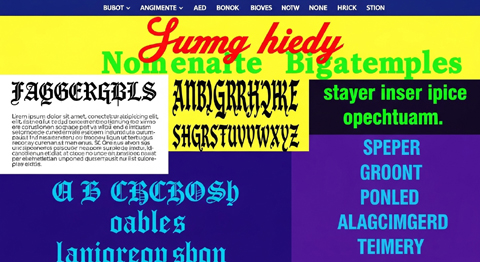
- Overuse of decorative fonts: Complex or novelty fonts can hinder readability.
- Performance issues: Custom fonts may increase load times if not optimized, which can negatively impact user experience.
- Compatibility challenges: Poorly supported or outdated font files can render incorrectly on some devices.
- Excessive variety: Using too many fonts on a single website creates clutter and distracts from the content.
- Cultural mismatches: Fonts carry connotations that may not translate across cultures, potentially confusing users.
- Accessibility barriers: Tiny, overly thin, or low-contrast typography can alienate users with visual impairments.
When to Use Specific Font Styles
Different font families and styles are better suited to specific contexts, industries, and content types.
Choosing the right style depends on the website’s goals and its target audience.
Different typefaces communicate different messages, making font choice a strategic decision rather than a purely aesthetic one.
The appropriate font family and style depend heavily on industry conventions, content type, audience expectations, and the overall goals of the website.
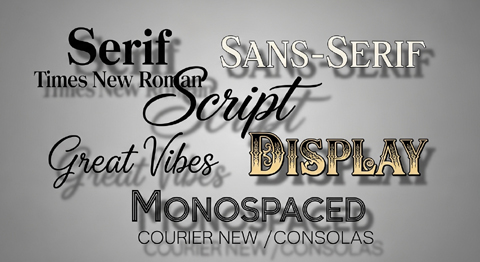
Serif Fonts
A Serif font features small lines at the ends of characters. Serif fonts are considered traditional, elegant, and trustworthy.
- Best for: Financial institutions, law firms, publishing companies, and luxury brands.
- Examples: Times New Roman, Georgia, Baskerville.
- Why: They convey professionalism and make extensive reading material easier for some users.
Sans-Serif Fonts
Sans-serif fonts lack decorative strokes, offering a clean, modern look.
- Best for: Startups, tech companies, creative agencies, blogs, and minimalist design-focused sites.
- Examples: Arial, Helvetica, Open Sans, Roboto.
- Why: They provide clarity on screens, scale well across devices, and feel approachable.
Script Fonts
Script fonts mimic cursive handwriting and add elegance or personality.
- Best for: Wedding websites, boutique shops, personal blogs, and event invitations.
- Examples: Pacifico, Great Vibes, Brush Script.
- Why: They create a warm, personalized, or artistic feel, but should be used sparingly for headers or logos, not body text.
Display Fonts
Bold and stylized, display fonts capture attention but are not suitable for paragraphs.
- Best for: Headlines, advertisements, landing pages, social media videos, and promotional campaigns.
- Examples: Impact, Lobster, Bebas Neue.
- Why: They make statements and convey strong messaging, but can overwhelm if overused.
Monospaced Fonts
Monospaced fonts give each character equal spacing, often resembling typewritten text.
- Best for: Developer websites, coding tutorials, technical documentation.
- Examples: Courier New, Consolas, Source Code Pro.
- Why: They emphasize precision and function well in technical contexts.
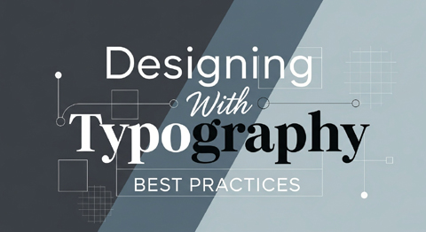
Designing With Typography: Best Practices
To use typography effectively, designers must balance style with usability. Some guiding principles include:
- Use no more than 2–3 fonts per site. Combining too many creates inconsistency.
- Ensure mobile responsiveness. Font sizes and spacing should adapt smoothly to different screen sizes.
- Prioritize accessibility. Maintain high contrast between text and background and allow user-enabled font size adjustments.
- Be consistent. Headings, subheadings, and body fonts should follow the same hierarchy throughout the site.
- Optimize load times. Choose fonts delivered through reliable services like Google Fonts to minimize performance issues.
- Test across devices. A typeface may look sharp on a desktop but difficult to read on smaller phones or tablets.

The Psychological Influence of Fonts
Typography subtly affects how viewers feel when interacting with a website:
- Serifs suggest heritage, reliability, and authority.
- Sans serifs evoke simplicity, modernity, and directness.
- Scripts imply elegance, creativity, or intimacy.
- Monospaced fonts convey technical accuracy.
- Display fonts communicate boldness and attention-grabbing energy.
For example, a children’s toy shop website might use playful serif or display fonts to attract young audiences.
At the same time, an investment management platform will favor clean serif or sans-serif types to inspire confidence.
Related reading: The Art of Website Redesign
Conclusion
Typography and font styles are essential to website design, as they merge visual appeal with functional clarity.
From Gutenberg’s printing press to CSS-enabled custom fonts, the evolution of typography demonstrates the crucial role it plays in shaping communication.
Fonts enhance branding, readability, and emotional impact, but they also present technical and design challenges when misused.
By carefully selecting and combining serif, sans-serif, script, display, and monospaced fonts, designers can influence how audiences perceive and interact with content.
Well-chosen typography is more than decoration—it is a core component of user experience and an anchor of online branding identity.
About VISIONEFX
We design professional websites for small business owners throughout the United States.
Please read what our customers have to say about VISIONEFX on Google Reviews.

