

The Mobile Mistakes We Find in Every Audit (and How to Spot Them on Your Own Site in 10 Minutes)
We run mobile audits constantly — a ten-category checklist we’ve refined across years of WordPress sites, with builder-specific tests for Elementor, Divi, Apress, Yoo Themes, Beaver Builder, WooCommerce, and the major form plugins: different businesses, different designers, different themes. And yet the same handful of mistakes show up so reliably we could print the report before opening the site.
That’s worth your attention for one blunt reason: Google uses mobile-first indexing for every website, which means the phone version of your site is your site for rankings — and with mobile driving well over 60% of traffic, it’s your site for customers, too. Here are the seven repeat offenders, why they happen, and how to catch them yourself.
1. The Mobile View Nobody Configured
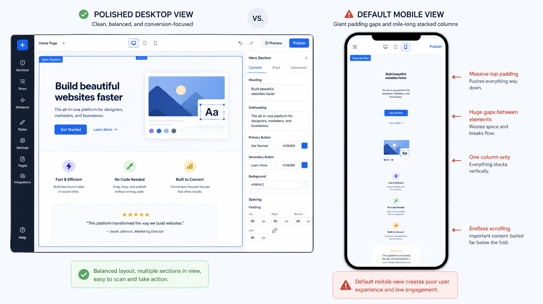
The most common mistake isn’t a bug — it’s an unfinished job. Page builders like Elementor, Divi, and Beaver Builder all have separate mobile settings for spacing, font sizes, column behavior, and visibility. Designers build the desktop view, glance at the auto-generated mobile version, and ship it with every mobile control still at its default.
The result is a site that technically “responds” by shrinking: desktop-sized padding creating vast empty gaps, six-column layouts collapsing into a mile-long single column, headings sized for a monitor devouring a phone screen. The fix is unglamorous: every builder page needs its mobile view designed, not just tolerated — stacking order chosen, spacing adjusted, typography scaled on purpose.
2. The One Element That Breaks Everything (Horizontal Scroll)
Load a page on a phone and nudge it sideways. If the whole layout slides left and right, one element somewhere has a fixed width wider than the screen — an oversized image, a data table, an embedded map, a section with hard-coded pixel dimensions — and it’s dragging the entire page with it. Visitors experience it as a site that feels broken and cheap, with text running off-screen mid-sentence.
One rogue element is all it takes, which is why this survives on otherwise decent sites: it lives on the one page nobody retested after an edit. The cure is containers and images that flex to the screen (max-width: 100%) instead of demanding pixels the phone doesn’t have — and re-checking after content changes, because this bug is usually introduced, not inherited.
3. “Hide on Mobile” Hiding the Wrong Things
Builder visibility toggles are useful — until we open a site’s mobile view and the phone number, the trust badges, or an entire service section is gone, hidden years ago to “clean up” a layout problem someone didn’t know how to fix properly.
This mistake now costs twice. Customers can’t act on what they can’t see — and under mobile-first indexing, Google largely can’t rank what your mobile version doesn’t show. Content hidden on mobile is content you’ve quietly withdrawn from search. In audits, we check what mobile visitors can’t see as carefully as what they can, and the findings routinely shock owners who’ve never viewed their own site the way most of their customers do.
4. Buttons Built for Cursors, Not Thumbs
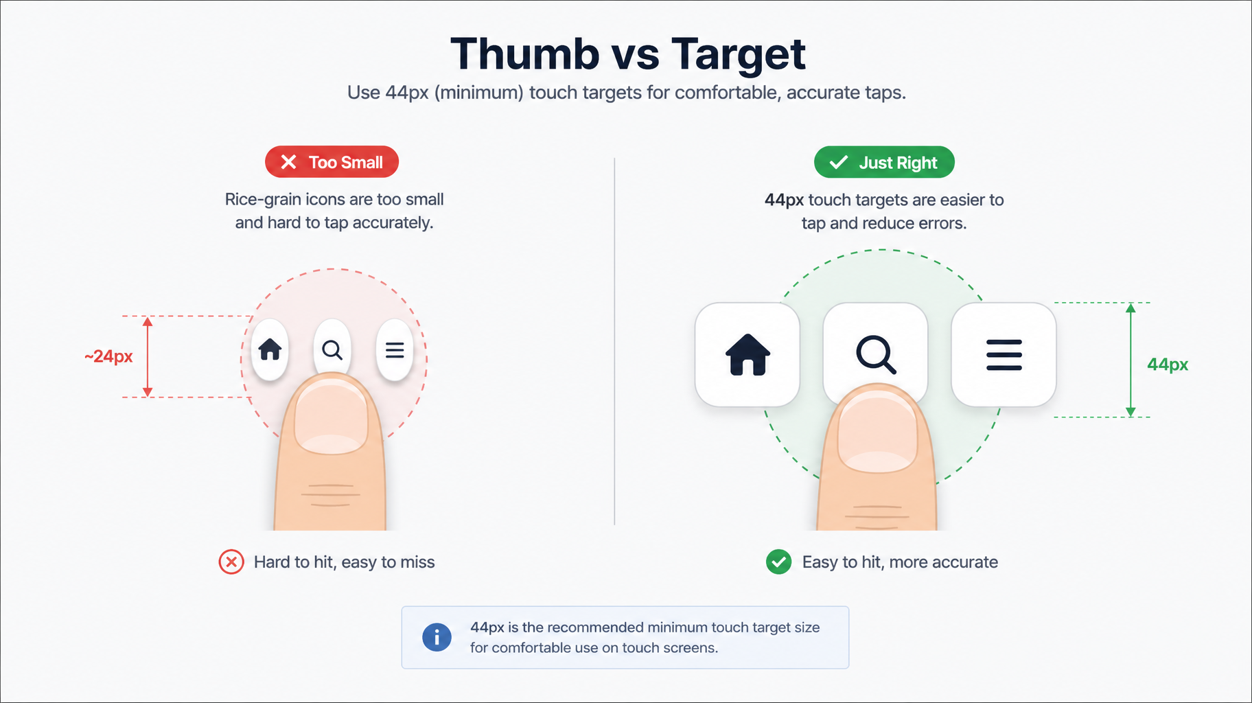
A mouse pointer is a few pixels; a fingertip needs a target of roughly 44×44 pixels — the long-standing Apple and accessibility standard — with breathing room between neighbors. Every audit finds violations: tiny text links stacked tight, icon buttons the size of rice grains, menus that require surgeon-grade precision.
Two cousins of this mistake deserve special mention. Hover-dependent dropdowns — submenus that only appear on mouse-over — are unreachable on touchscreens, silently amputating whole sections of navigation. And body text below 16 pixels forces the pinch-zoom shuffle; worse, some themes ship with zooming disabled outright, which is both hostile and an accessibility failure. Notably, most screen reader users primarily browse on mobile, so thumb-friendly and accessible are largely the same project.
5. Forms That Fight the Thumb That Feeds You
Your contact form is where mobile traffic becomes money. It’s where we find the most self-sabotage: input fields that summon the full-text keyboard for phone numbers instead of the number pad, fields the popup keyboard then covers so people type blind, multi-column layouts that collapse into confusion, and submit buttons that fail the thumb test from mistake #4. Meanwhile, the phone number in the header is plain text — on a phone — instead of a tap-to-call link.
Each fix is small: correct input types so the right keyboard appears, single-column form layouts on mobile, full-width submit buttons, clickable tel: links. Together they’re the difference between a lead and a sigh. And once the form submits, make sure the notification actually reaches you — we wrote a whole article on leads landing in spam, because a mobile-perfect form feeding a broken email pipeline is a leak with extra steps.
6. The Plugin Pile-On
Individually, the chat widget, the popup cookie banner, and the sticky header each seemed reasonable. On a phone, they arrive together: a header eating the top fifth of the screen, a chat bubble squatting in the bottom corner, a cookie bar across the bottom, and a promotional popup in the middle. The visitor’s screen belongs to everyone except your content — and Google has penalized intrusive mobile interstitials for years.
The related sin is layout shift: late-loading widgets, ads, and embeds that shove the page around just as someone’s thumb descends on a button. In audits, we test with every plugin firing, because that’s what real visitors get. The standard to hold: on a phone, your content is the main character; everything else auditions for one small supporting role at a time.
7. Pages Too Heavy for the Connection They’ll Meet
Desktop Wi-Fi forgives; a phone on two bars of LTE in a parking lot does not. We routinely audit pages weighing well past three megabytes: full-resolution hero images, autoplaying videos, and a dozen scripts loading before the first word of content. The behavioral math is unforgiving: around half of visitors abandon pages that take more than three seconds, and mobile is where those seconds are lost. It shows in the field data too — barely half of mobile sites clear Google’s Core Web Vitals bar, which means passing it is a genuine competitive edge, not table stakes. Compress and properly size images, lazy-load below the fold, and load scripts after content: boring fixes, outsized returns.
The 10-Minute Self-Audit
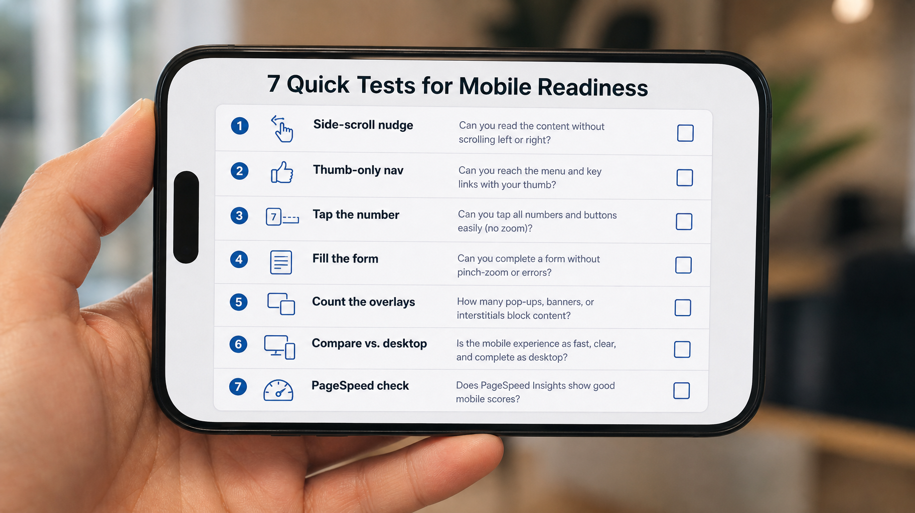
You can catch most of this tonight. Take your actual phone — off Wi-Fi, on cellular — and open your site like a stranger. Nudge pages sideways, hunting for horizontal scroll. Navigate everywhere using only your thumb, no zooming allowed. Tap the phone number and see if it dials. Fill out the contact form completely and note every fight the keyboard picks. Count what’s stacked on the screen besides your content. Then compare the mobile page against desktop and ask what’s missing. Finally, run one key page through Google’s PageSpeed Insights on the mobile tab and read the diagnostics.
That self-check catches the obvious. Our full audit runs the ten-category version. For instance, viewport and breakpoints, overflow, typography, navigation, touch targets, media, WordPress and builder-specific checks, performance, and forms — because the subtle failures hide between the obvious ones. Either way: if the audit turns into a long list, that’s your redesign conversation starting, with data instead of guesswork.
FAQ
My theme is “fully responsive” — doesn’t that cover me?
Responsive means the layout can adapt, not that it adapts well. Themes provide the mechanism; your specific content, builder settings, plugins, and edits determine the result. Most of the mistakes above occur on responsive themes — introduce one page edit and one plugin at a time.
What is the 44-pixel rule?
It’s the widely adopted minimum size for anything a finger taps — roughly 44×44 pixels, drawn from Apple’s interface guidelines and echoed in accessibility standards — with spacing between adjacent targets. Smaller targets produce mis-taps, frustration, and abandoned sessions, especially for older users.
Does mobile experience really affect my Google rankings?
Directly. Google indexes and ranks the mobile version of your site — mobile-first indexing applies to every website — and mobile page experience signals like Core Web Vitals feed rankings. Content hidden on mobile is largely invisible to Google, and a slow mobile page is both a ranking and conversion problem.
The site looks fine on my phone — why do customers complain?
Because there’s no standard phone, screen sizes fragment across dozens of common resolutions, and your phone, browser, and cached visits hide problems strangers hit fresh. That’s why audits test multiple viewport widths and real devices rather than trusting any single screen — including ours.
How often should mobile get re-checked?
After every meaningful change: theme updates, new plugins, redesigned pages, added popups, widgets, mobile breakage is usually a regression — the site was fine until an update shifted something — which is why our maintenance work includes recurring mobile checks rather than treating the launch-day audit as permanent.
The Bottom Line
None of these seven mistakes requires a rebuild to fix, and none survives an honest audit. What lets them thrive is simpler: businesses experience their own websites on desktop, in the office, on Wi-Fi — while their customers experience them on a phone, in motion, on cellular.
Close that gap, and you fix the leaks; ignore it, and every marketing dollar pays a mobile tax on arrival.
Want the full ten-category version, with the builder-specific checks and a prioritized fix list your developer can run with? Request a mobile audit — we’ll show you your website the way your customers actually see it.