
Before & After: The Creative Journey of a Website Redesign
When businesses think of a web redesign, they often picture a fresh homepage banner, new fonts, or perhaps a cleaner navigation bar.
But a true redesign is not about surface-level changes—it’s about reimagining the entire digital experience through creativity, strategy, and storytelling.
To understand this transformation, let’s walk through a fictional but realistic example, comparing a brand’s “before” and “after” states of a website redesign.
By breaking down what changed and why, we can see how creative design principles elevate both perception and performance.

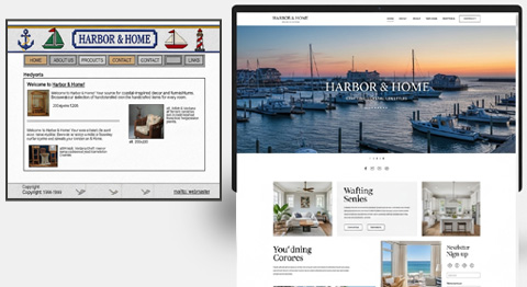
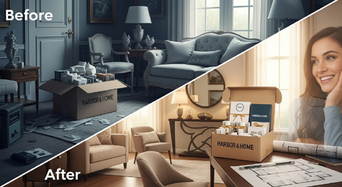
The “Before”: A Website Stuck in the Past
Their website, built seven years ago, suffered from several creative flaws:
- Visual Stagnation: The site employed muted navy and beige tones that once suited the brand, but now appeared washed-out and uninspiring. Nothing “popped.”
- Stock Photography Overload: Generic, awkward stock photos of smiling families dominated the homepage, disconnecting the brand from the authenticity it wanted to portray.
- Fixed-Width Layout: On desktop, the website looked contained and outdated. On mobile, it felt cramped and cluttered, causing frustration.
- Cluttered Homepage: The brand’s story was buried. Too many calls-to-action competed for attention, from blog links to product promos. Nothing guided the user journey.
- Minimal Engagement Features: Static product galleries lacked motion, interactivity, or storytelling elements.
Perhaps most damaging: visitors landed on the site and struggled to feel anything. In the age of visual-first impressions, that lack of emotional resonance was costing Harbor & Home conversions, returning traffic, and brand loyalty.
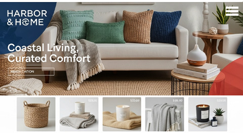
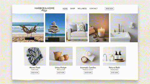
The “After”: Redesign as Creative Rebirth
Now, let’s see how Harbor & Home transformed their site through a creative redesign process.
1. A Fresh Visual Language
The redesign began with a new color palette inspired by coastal landscapes—soft sand, seafoam green, and brighter ocean blues.
Complemented with warm peach and terracotta accents, the site immediately conveyed a sense of serenity and vibrancy. Customers felt a lifestyle story unfolding the moment they landed.
Typography was also updated: the serif fonts of the old site were swapped for a humanist sans-serif that felt friendlier and more approachable, paired with a modern cursive accent font to bring out movement and creativity.
2. Authentic Imagery Over Stock Photos
Instead of relying on stock images, Harbor & Home invested in a custom photo shoot.
Products were staged in real homes near the shoreline and photographed using natural light. This instantly made the site feel authentic.
Additionally, hand-drawn illustrations of seashells and coastal elements were placed as subtle embellishments throughout the site.
These details gave a sense of craftsmanship, reinforcing the brand’s artisanal values.
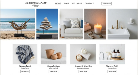
3. Layout Transformation: From Fixed to Full-Screen
The redesign replaced the rigid fixed-width container with a full-screen immersive layout.
- Product hero banners stretched edge-to-edge, giving visitors the sensation of “stepping into the brand world.”
- Responsive grid systems adjusted beautifully to mobile screens, ensuring every user experienced consistency across devices.
- Whitespace was leveraged more intentionally—each section felt clean and digestible rather than overwhelming.
4. Embracing Motion and Subtle Animation
To improve engagement, the redesign used micro-animations sparingly but effectively:
- Buttons glowed slightly upon hover, inviting clicks.
- Product images shifted gently with parallax scrolling, adding depth and storytelling motion.
- The homepage integrated a 10-second silent background video of ocean waves lapping a shoreline, instantly immersing users in the coastal theme.
These elements weren’t “flashy gimmicks”—they created a sensory experience aligned with the brand identity.
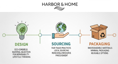
5. Infographics for Simplicity
Harbor & Home had struggled to explain its sustainable sourcing practices on the old text-heavy site.
The new version used clean, modern navigation and infographics to summarize “Our Sustainability Promise.” Icons showed how products were designed, sourced, and packaged sustainably.
This simplified storytelling visually aligns with the eco-conscious values of the target market.
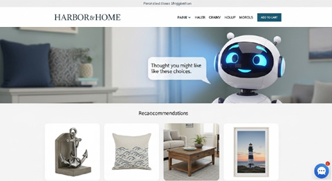
6. AI-Powered Personalization
The most significant leap came from integrating AI-based personalization tools. Now, returning customers saw tailored product recommendations based on browsing history. Moreover, the site also tested alternate color schemes and layouts in real-time to see which combinations were most effective at driving conversions.
The AI didn’t replace creativity—it amplified it. Above all, designers could experiment more boldly, knowing real-time testing would optimize for outcomes.
Key Takeaways from the Redesign
Here’s a side-by-side of Harbor & Home’s “Before” vs. “After”:
| Aspect | Before Redesign | After Redesign |
|---|---|---|
| Colors | Muted, outdated navy/beige | Fresh coastal palette with accents |
| Imagery | Overused stock photos | Authentic lifestyle photography & custom illustrations |
| Layout | Fixed-width, boxy, outdated | Fluid, full-screen, responsive, clean whitespace |
| Motion | Static galleries, zero animation | Subtle video, parallax effects, micro-interactions |
| Storytelling | Buried under clutter | Bold, clear hero message with linear user journey |
| Transparency | Text-heavy sustainability notes | Visual infographics for easy understanding |
| User Experience | Generic, cluttered, non-emotional | Personalized, immersive, emotionally resonant |
The after unleashed creativity not as decoration, but as a strategic tool for a custom web design that aligns aesthetics, brand values, and conversion goals.
Signs Your Website is Ready for a Creative Redesign
- Your design looks dated compared to competitors.
- Customers tell you the site feels confusing.
- Your bounce rate is unusually high.
- Brand photography and visuals don’t reflect your current identity.
- You still rely heavily on fixed-width layouts.
- You’ve never tested animation, video, or interactive design elements.
- Your site lacks Personalization or meaningful engagement.
If you nodded to more than 3 of the above, your site is sending the wrong first impression.
FAQ: The Before-and-After of Redesign
Q1: How do I know if redesigning creative elements will impact business, not just “make it pretty”?
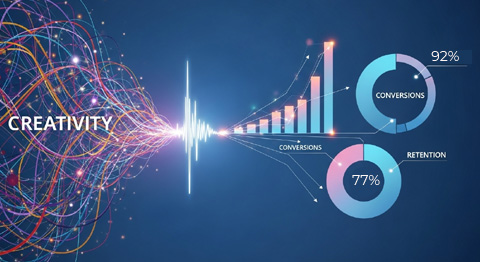
Because aesthetics shape trust, if your site looks modern, authentic, and engaging, customers are more likely to stay, interact, and buy. Web design creativity drives measurable metrics like conversions and retention.
Q2: I don’t have a big budget for video and animation. Should I skip it?
You don’t need flashy, studio-level videos. A short loop shot in natural light (like Harbor & Home’s beach waves) can be inexpensive and impactful when applied thoughtfully.
Q3: Isn’t using AI too complex for small brands?
Not anymore. Many website builders integrate basic AI personalization features. Even modest investments can yield significant payoffs in tailoring the user experience.
Conclusion: Creativity is Transformation
The journey from “before” to “after” isn’t just cosmetic—it’s emotional, strategic, and deeply brand-aligned. Harbor & Home’s story shows how a redesign can breathe new life into a company’s digital presence, translating abstract brand values into visuals and experiences users feel.
When brands take the plunge into redesign with creativity at the helm, they don’t just refresh their websites—they redefine how customers perceive, trust, and connect with them.
Because in the end, your website is never a static brochure. It’s your digital stage, and creative redesign ensures your brand always performs at its best.
Website Redesign Virginia Beach by VISIONEFX
We design professional websites for small business owners throughout the United States.
Please read what our customers have to say about VISIONEFX on Google Reviews.

